
Cocina Libre
“I made an initial attempt to disguise a publication with forgery in my 2018 project Cocina Libre, without technical perfection."
A mockup interior view I made from pages of this zine and the photograph at right of the inspirational source booklet.
I found this other premium example of a comb-bound book in a local Toronto used book store. There is something utterly obscene about the cheap quality of the binding, the hypersaturation of the glossy color printing, the choices in presentation that for some reason always involve olives, mayo, or some kind of unnaturally colored sauce. This is all heightened on this cover by the presence of a very phallic moulded lobster salad on the bottom left (the tail is at the top and head/claws at the bottom).
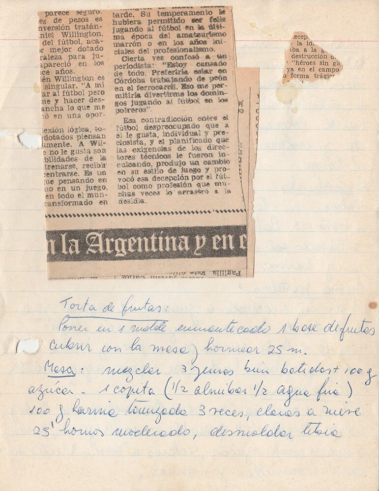
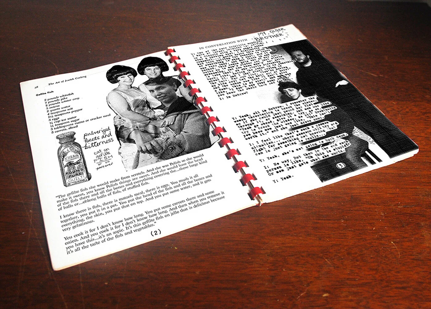
The recipes in the book were all from my mother, or her mother. I asked her to scan her favorite examples, or tell me what she remembers. So half the recipes are handwritten, such as this one. Others are dictated in the vague way that includes ingredients but excludes proportions, and gives no times or temperatures, but is so sure and confident. This recipe is for a fruit cake.
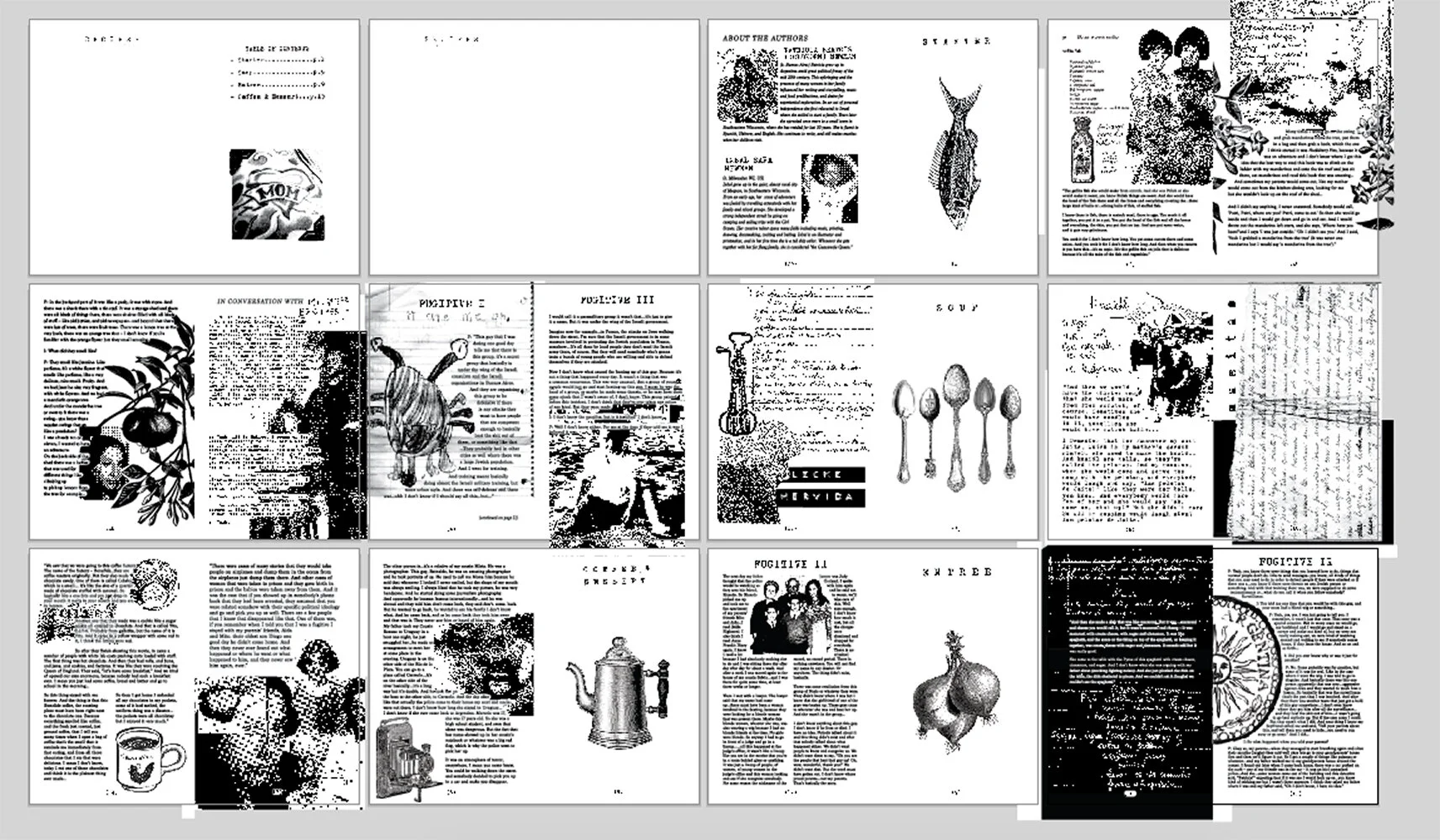
Complete layout of all the pages included in the cookbook. Recipes were mashed together with funny, nostalgic, and sometimes disturbing memories of food such as matzoh balls, chocolate, mandarin oranges, gefilte fish, and a weird spaghetti casserole thing. These stories were accompanied by other poem, stories, and interviews from my mother’s life about being in a youth paramilitary group, visiting a Buenos Aires coffee factory, the people she knew who were lost in the dirty wars, and getting in a parking argument with an angry Israeli lady one time.
I made the decision to print the cover by hand, using a four-color silk screen process. This was going to be no easy task. However, I was aware of how much sloppy printing can affect the overall grotesqueness of an image and felt it would be best to lean into it. The sloppier the print, the more sickening the image becomes. I remember feeling physically repulsed when, as office manager for an architecture membership organization, I would sort cheap newsletters out of the organization’s mail, lingering with horrified fascination on disproportionate faces, bug eyes, and misplaced noses due to poor printing.
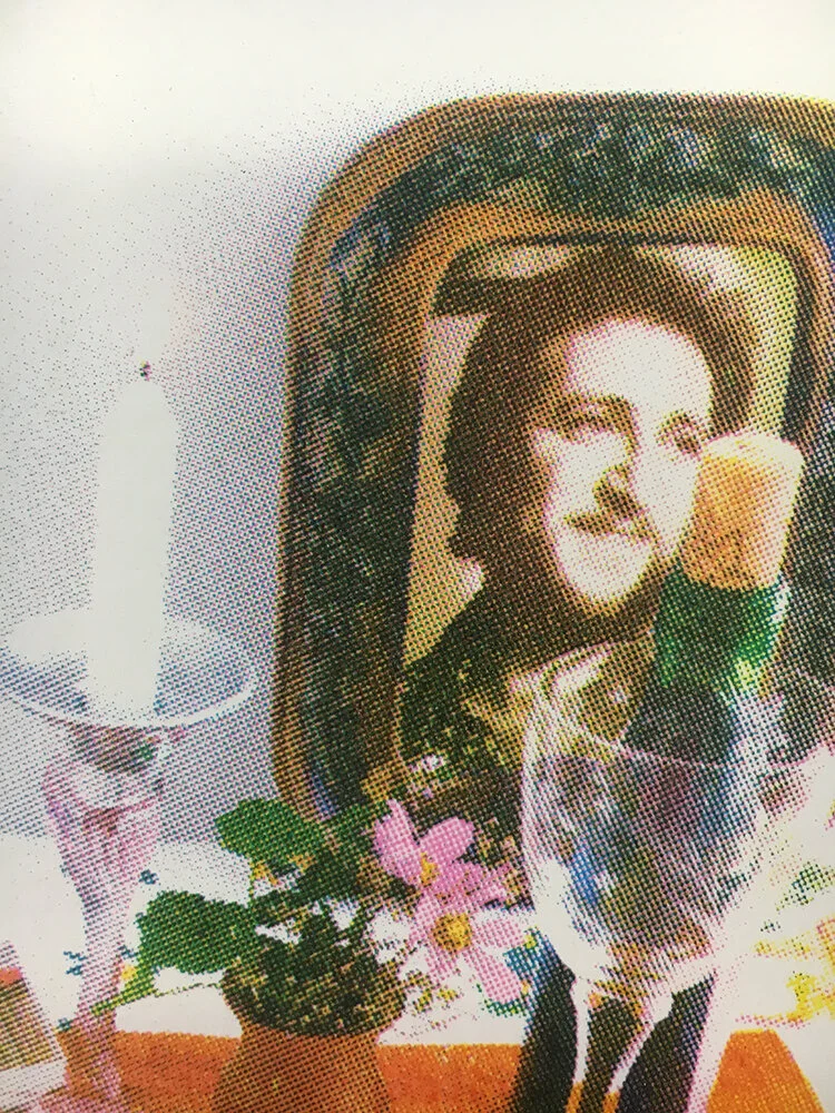
This closeup on one of the printed covers shows how well I CAN register four color prints, and how beautifully the image appears when squarely lined up. However, I did not choose this image as one of the final covers because I was hoping to physically repulse readers with my sloppy printing. This print was simply too beautiful.
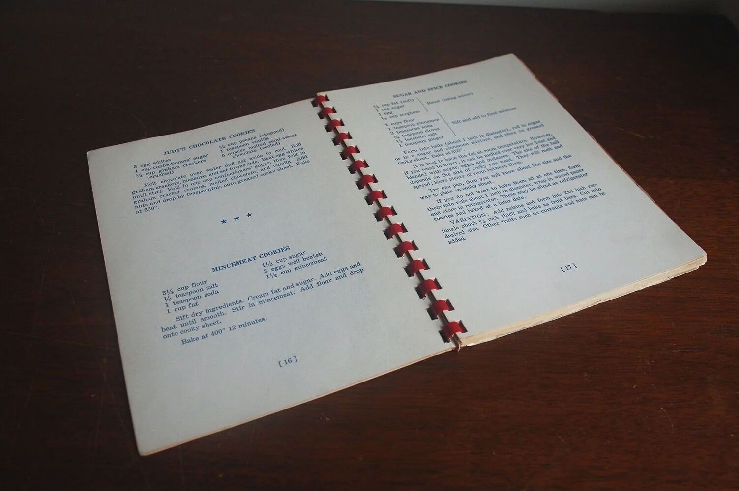
The form was borrowed from cheaply produced kitschy cookbooks in general, but I found inspiration in this booklet in particular. The blue printing and red comb binding are so simple and familiar. Because comb binding is considered so unstable and cheap as an option for binding, it fell out of favor. The closest equivalent now is spiral binding, which is sturdier. I found out that, even though the service is entirely unlisted anywhere, the OCAD copy/print center DOES in fact have a comb binding machine, I just had to provide the combs (which I cut to size myself). The machine both punches the rectangular holes and binds the books! Each book was only $5 to bind, and the people who work there are very kind.
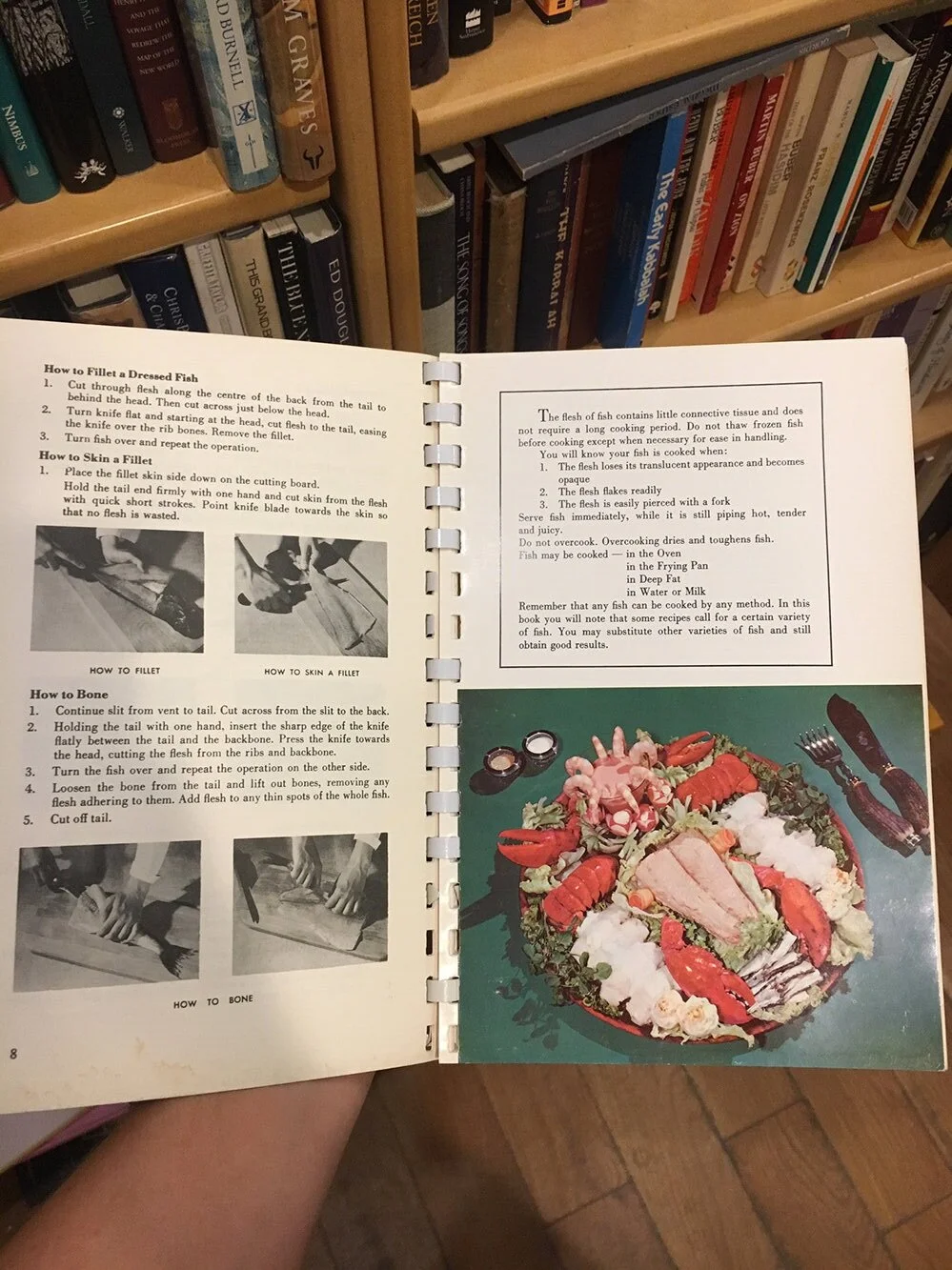
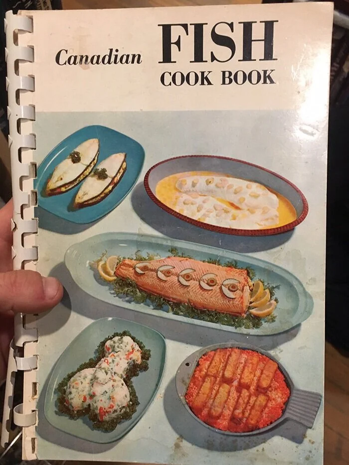
The comb binding was coming apart a bit at the bottom. I’m a bit regretful that I did not purchase this fine specimen of Canadian fish cookery. Printing costs were clearly spared by printing black and white on matte paper, and a few full color glossy pages. Again, we have an abstract obscene presentation with pink sauce. It is a thing of beauty. I channeled this simultaneous fascination and disgust in my cookbook, visually and narratively.
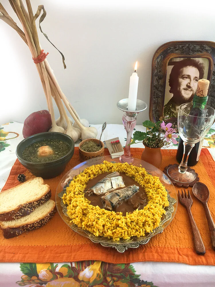
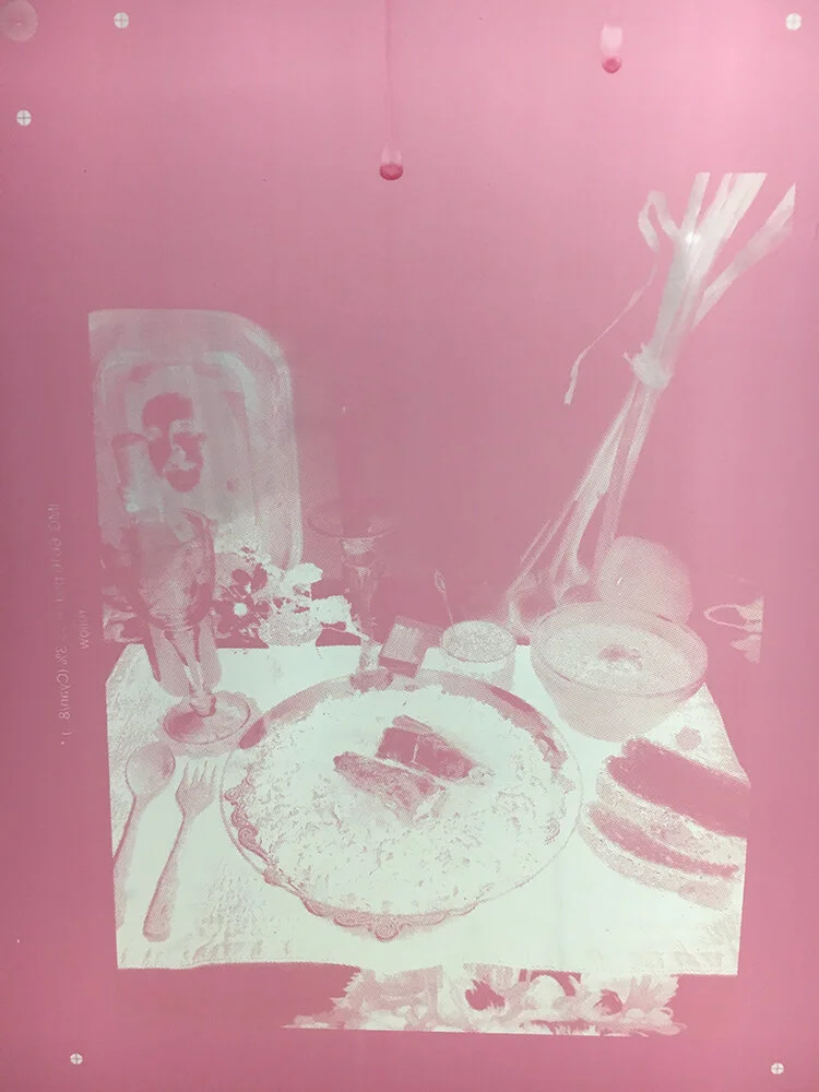
I wanted to recreate an oddly presented and slightly grotesque table setting. I specifically chose items that would fit a 1970s orange, brown, yellow, and green theme. I also set the scene to be a kind of nonsensical natural hippy table, including a miniature pinecone, hand carved wooden fork and spoon from a friend of mine, garlic stalks from my cousin’s farm near Killaloe, ON, carved bark box as a spice server, and a photo of my dad in the 1970s framed with a carved wood frame. The table cloth also feels very “harvesty” with orange, brown, and green pears peeking out from under the place setting. The food itself was meant to imitate the bizarre rings and mounds of food found in cookbooks of the 1950s-1980s (probably intended as a sign of a meticulous hostess who could present every meal just so). The odd choice of food pictured include challah slices, a ring of rice and pool of baked beans, topped with tinned sardines, faked matzoh ball soup, and a raw red potato. The food elements are also reminiscent of a Jewish shabbos table, complete with kosher wine, challah bread, and a lit shabbos candle.
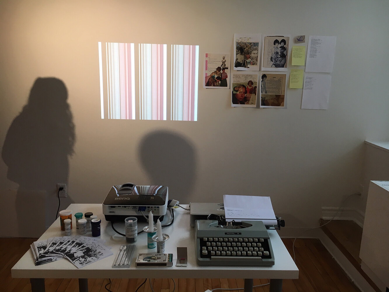
An installation of the preliminary material research for this booklet. On the wall at the top right of the image are digital collages of photographs of my mother, on the table are experimental zines with more collages, my trusty typewriter, shabbos candles, and different smell samples in pill bottles
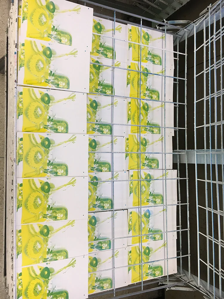
The first two layers (Yellow and Cyan) were looking great! I was printing 100 copies, and ended up with about 18 finished books. A few mistakes are already visible in this photograph. I did, however, curate out any prints that came out “too perfect” such as the image seen below.
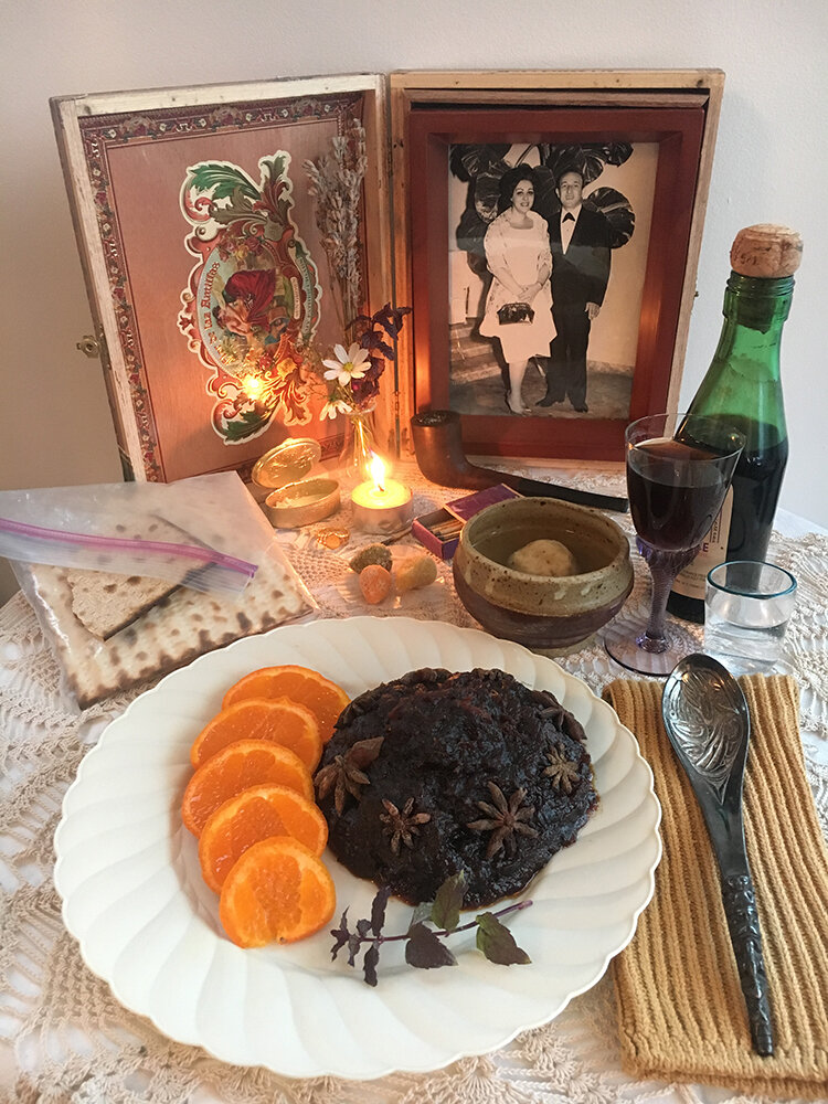
I had hoped to continue this series with a Passover-specific edition cookbook (note the matzah and lack of any leavened ingredients). I did photograph another lovely yet grotesque image for the imagined cover of such a book that never came into being. The cover includes similar shabbos elements (the wine, “bread” of affliction, and lit candle), the fake matzoh ball soup (actually a shaved down roll floating in water) makes a guest appearance, and the grotesque food pile is actually date square filling with star anise, purple mint stem, and sliced clementine. Bits of marzipan, a specific Passover memory from my grandmother, are also shown in the tableau. The napkin is a yellow sock. After this project, I did start to produce a half-ass zine with disgusting/shameful/memorable tales from Passovers past, but it was not up to the level of production as Cocina Libre I. These could be easily combined one day in the future.