
f.u.o.’s
“All ‘chapters’ contain information that can be connected into narrative but remain inconsequential (the stories are memorable but not revelatory, grand, impactful). This is the reason behind the chosen objects – their ability to blend, and their current status as nearly gone but still recognizable vessels of information.”
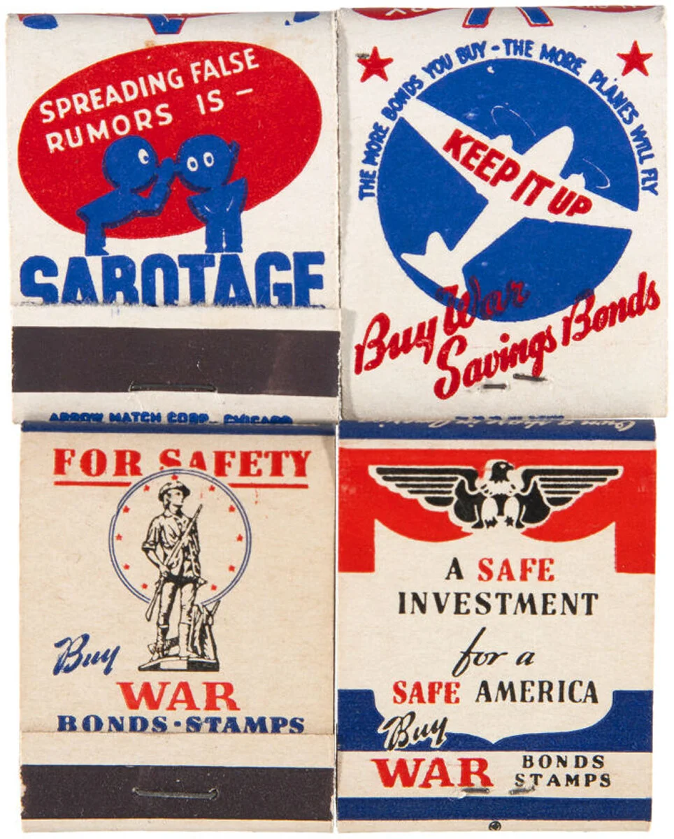
Some incredible examples of WWII era matchbooks for sale online. My favorite of these four is obviously the Sabotage/rumors one. My parents also have a matchbook collection with some interesting specimens (they also collect mini soaps, and my dad was a philatelist). The printed matchbook is a definite formerly ubiquitous object that for some reason only exists as decades old examples in massive collections. At a close range, one can note the effects of offset or relief printing - too much ink bleeding around small text, the overlapping layers of slightly transparent ink, a slight halo around edges with too much ink and pressure. It’s hard to see on these example because most of the printing is actually done quite well. On cheaper examples, the evidence of printing is more obvious.
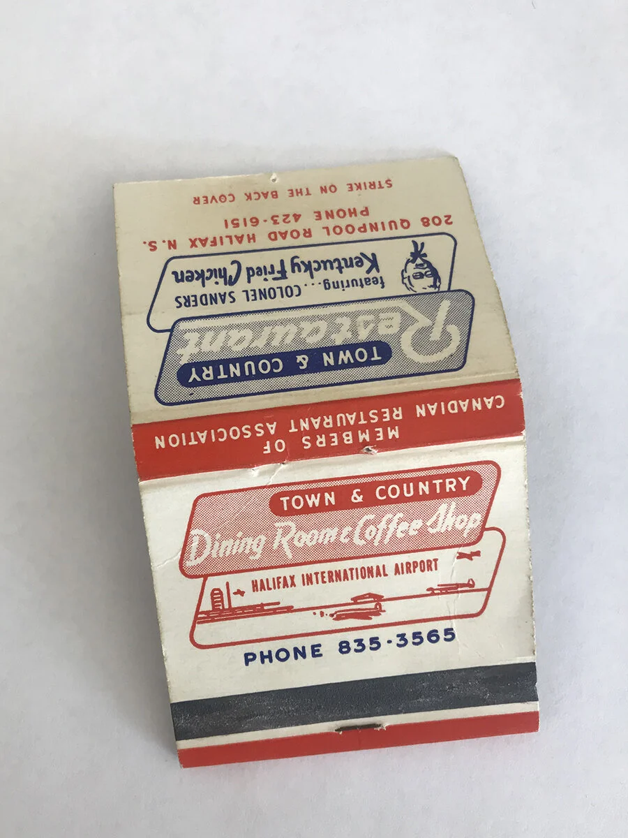
A lovely example from my own collection, also featuring blue and red printing. This example is also printed quite well, very clear edges and even has text cut out from a halftone-filled shape. I have not made an attempt to call the phone number.
delivery:
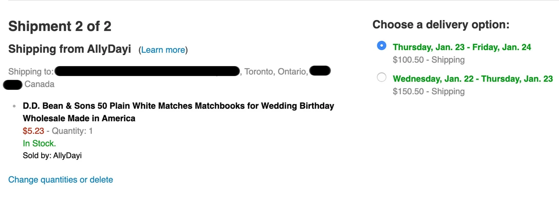
This shows the difficulty in matchbook delivery previously mentioned. The difficulty is not only that shipping would take a long time, but would also be expensive. A $5 box of matchbooks cost $100-150 in shipping and would have taken about a month to arrive. I assumed, and read others who said, the reason for this cost and delay is because matches are flammable, but found no official statement that confirmed this. I found matches that had a lower shipping cost, which was eventually refunded anyway when the package arrived late.
The square format photo album in all its cascading action glory.
This was the photo album I was originally searching for in the basement. It is the kind of album with paper pages, that still has photo corners stuck on the inside where photographs used to sit. The photographs were taken out for the scanning/archiving process, but the empty album itself is a fascinating book object.
And this is the outside of the found album. The corners are a bit worn, with paper coming up, fingerprints, smudges, and some pen marks. Still in decent shape, however.
I made a mockup before creating the real thing, closer to the size of the original album. The mockup is from extra materials found around my studio, so the bookcloth is actually muslin from my sewing supplies over pieces of plywood, and the sleeves are made from an Above Ground Art Supply bag.
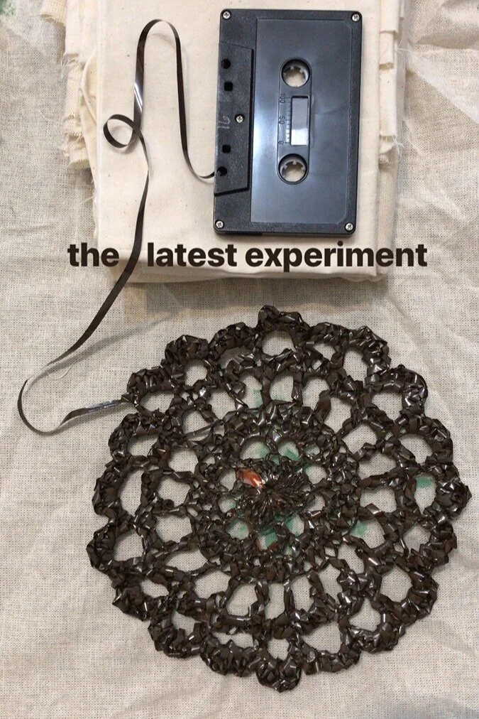
This was the first of the tape crochet I tried, at the spring 2019 residency in Wisconsin. It had little relevance to my project there at the time, but experimenting with the material led to all these interesting questions. I told another resident at the time that I was recording my spoken notes from my walks around the rural area to make a map, and then making this doily with the tape when I was through with the notes. His response was “So it’s like a different kind of map.” This sparked my interest in the possibilities of working with tape.
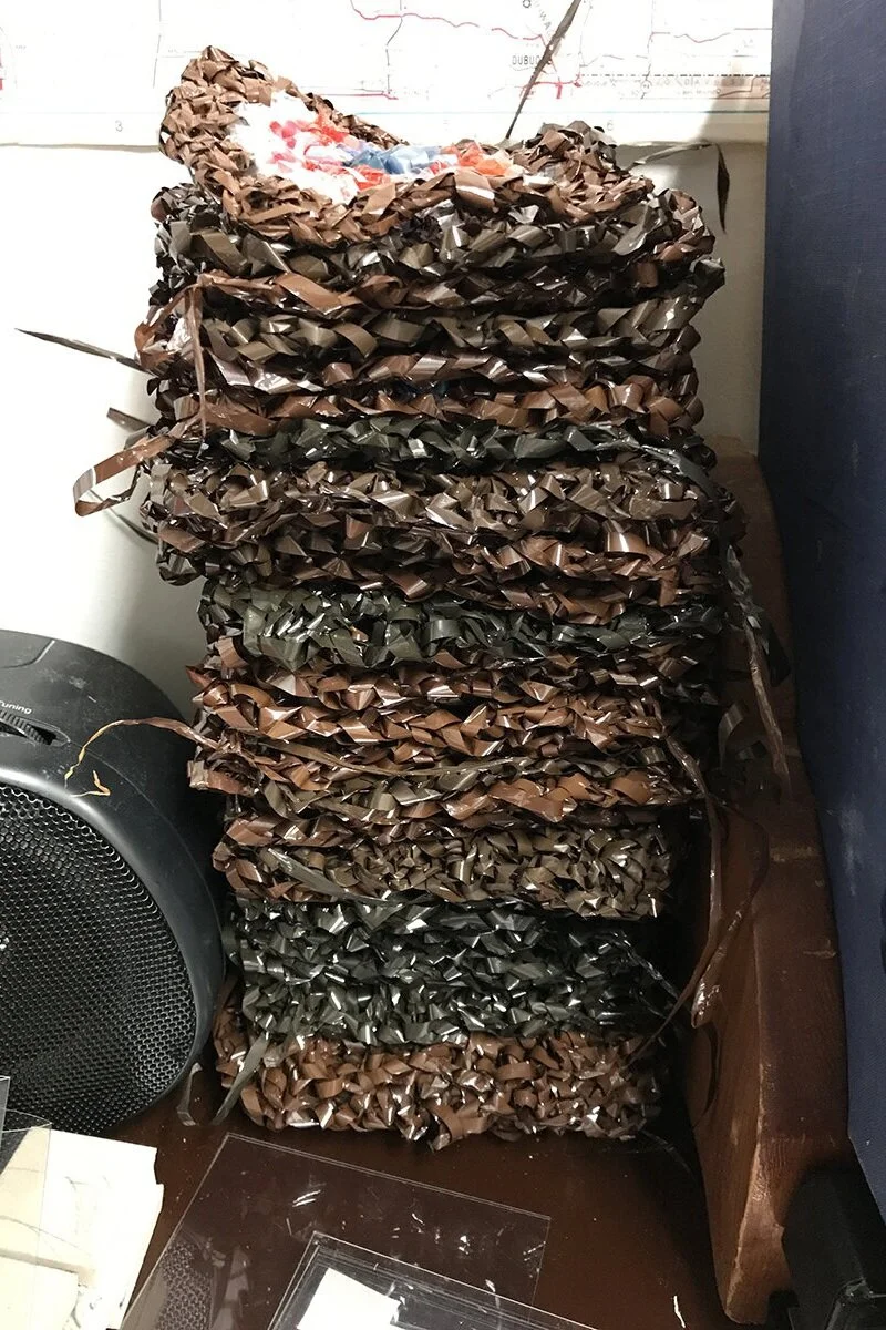
This is a stack of the squares before being combined into a quilt. I made each square individually, often crocheting on the train or streetcar. It usually caught the attention of strangers, who always wanted to comment on what I was doing. One woman thought it was incredible that I was crocheting tape with the characteristic white Apple headphones in. Another man on a train smiled and simply said to me, “Most people wouldn’t know what that is, but I know what that is.” When I had enough squares, I combined them into rows, and combined the rows together into the full blanket.
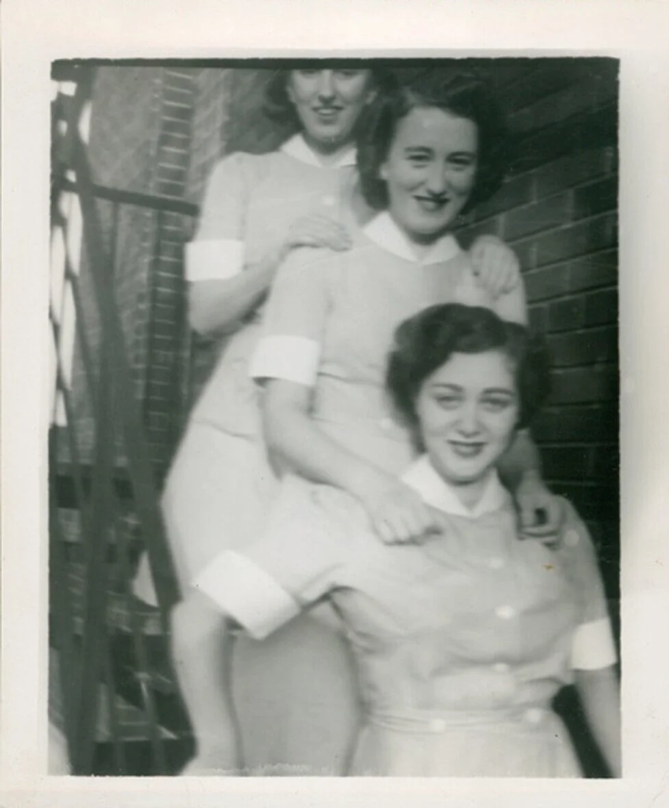
I scoured hundreds more photographs that would have made great book covers. This one in particular that sadly did not make the cut is my grandmother ( at the bottom) while she was studying nursing in Montreal, before she married my grandfather. She lived with other young women who were studying to be nurses as well. I narrowed down my criteria for covers to photographs that also had active and engaging content on the flip side, but she wrote on so many reverse sides of photos that narrowing down the selection even further was difficult.
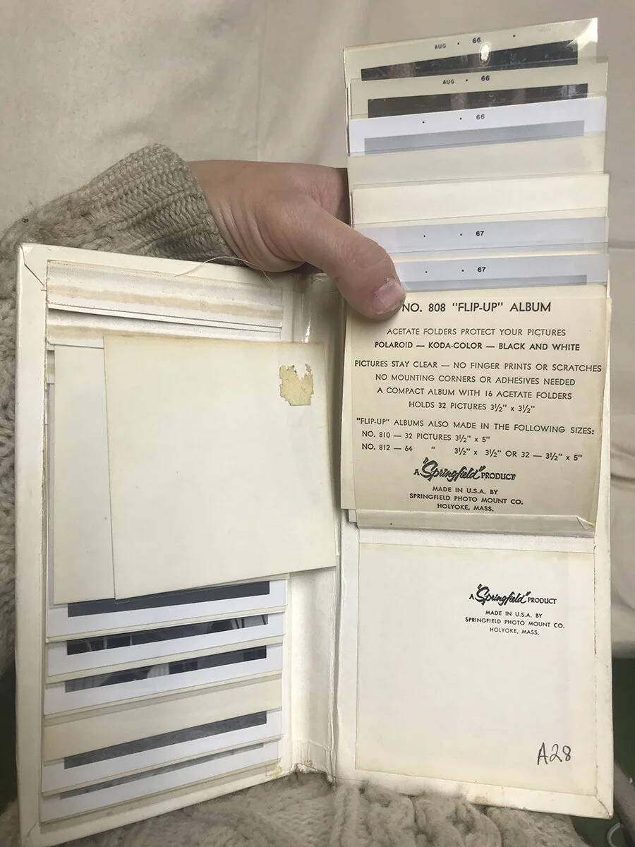
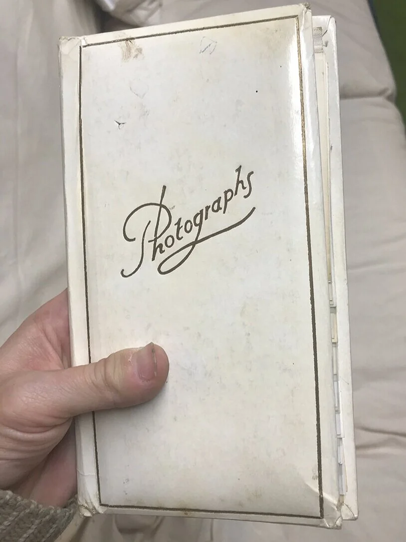
Turns out the inside has 16 sleeves (not the 14 I originally wrote about)! This little insert at the very back provides information on the album itself. Again, like the textual backs of the photographs, I love how important and yet completely hidden this insert is. The focus of most of the album is obviously to put photographs on display. But way at the back, this sleeve has all the information necessary posted right inside, so I had very little research left to do. All I needed was to reference this card and make my own decisions based on the information upon it.
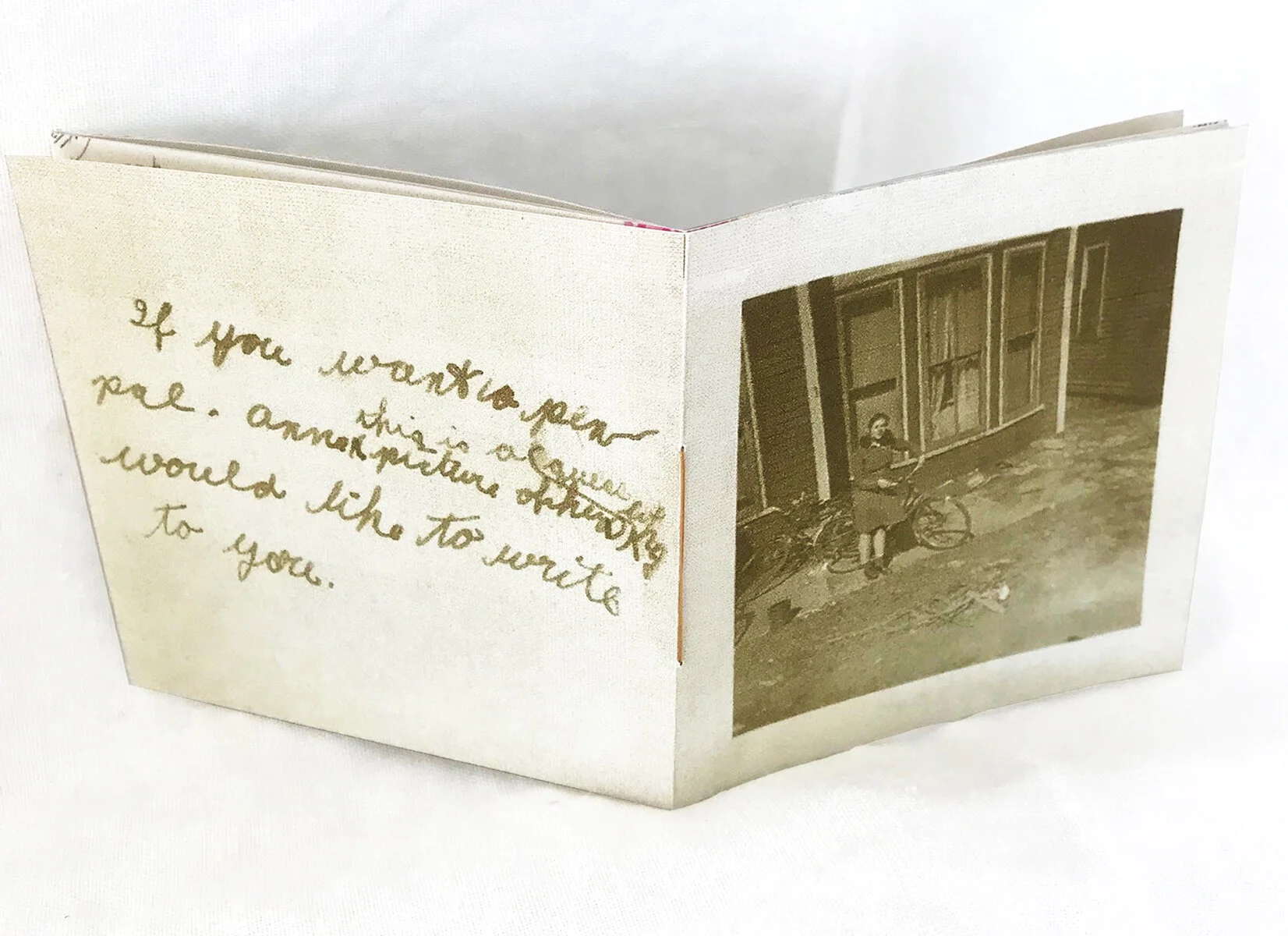
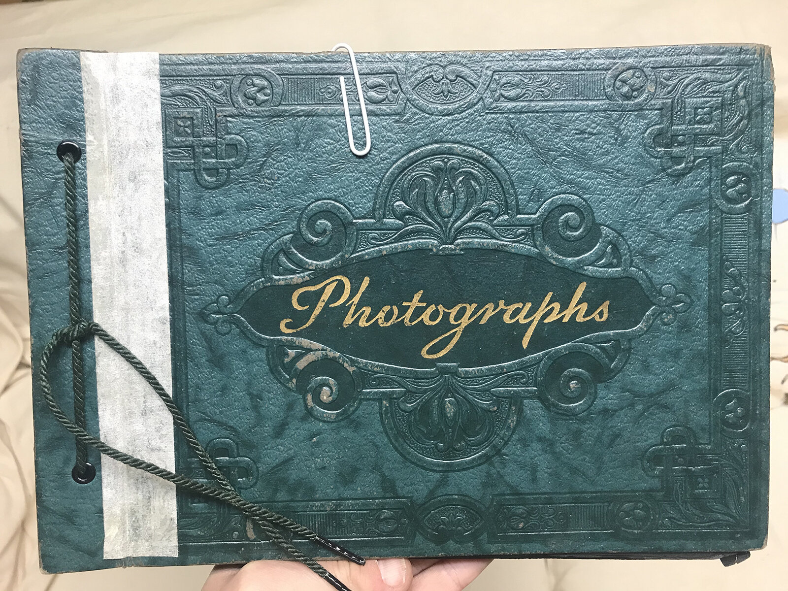
A shot of the front and back covers. The image is of my grandmother at about 15 years old on a bicycle in Halifax, NS. The text reads “If you want a pen pal. Anna ^ this is a picture of her ^ guess who would like to write to you.” The binding was kept as simple as possible (and using only one signature) to maintain the illusion of a photograph even in the sleeves. I used a light sepia-tone thread with one long stitch, tied in the very center, where the book “ends” and begins again toward the other cover.
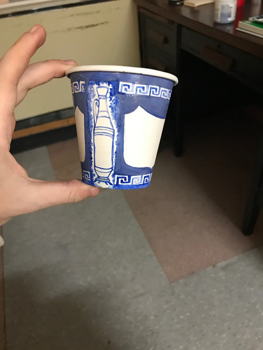
These are progress shots of my replica Anthora cup. I wasn’t able to find any online (at least not under 50pcs.) and I had half a mind to call up my brother or a friend or two in NYC to ask if they could find and send me one in the mail. But I didn’t want to put the burden on them, plus the container did not need to be an original. It was perhaps better that I took the time to paint the cup myself. I imagine when Leslie Buck first painted the designs for the Anthora in the 1960s, he worked on a much larger scale at a drafting table, perhaps wearing a white collared shirt and a tie.
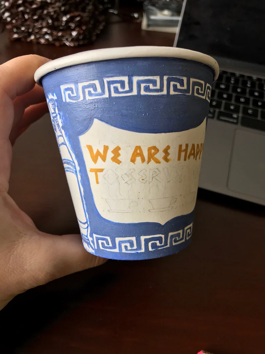
Painting at a 1:1 scale was much more difficult, as was painting straight lines on a 3-dimensional object. Fitting the type was especially tough, and making both sides balanced and proportionate to each other was a challenge. Luckily, because only one side is visible at a time, the differences between either side are barely noticeable. The hand painted quality of the cup is also somewhat endearing - the square scroll patterns on the top and bottom are not quite straight either, and the amphora vessel on either side is highly illustrative.
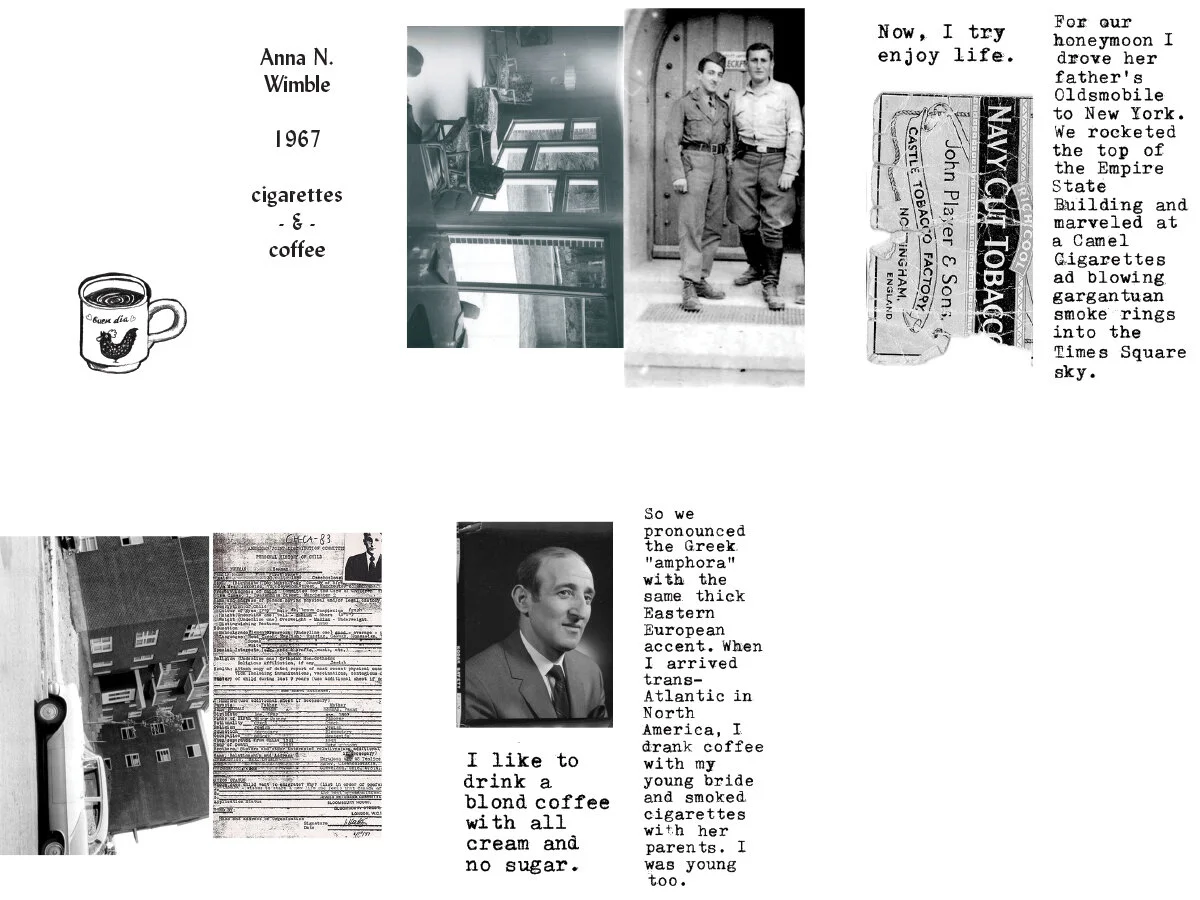
Pages in black and white (eventually printed on brown) of the book found inside the coffee cup. It details a relationship with coffee and cigarettes, and speculates about Anna Wimble’s possible early adolescent meeting of Leslie Buck as they grew up in the same remote Czechoslovakian town.
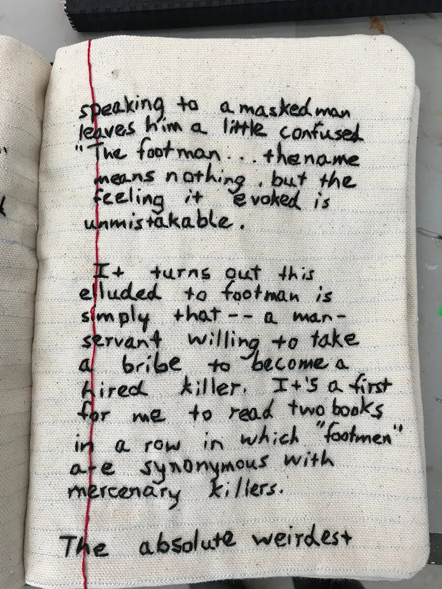
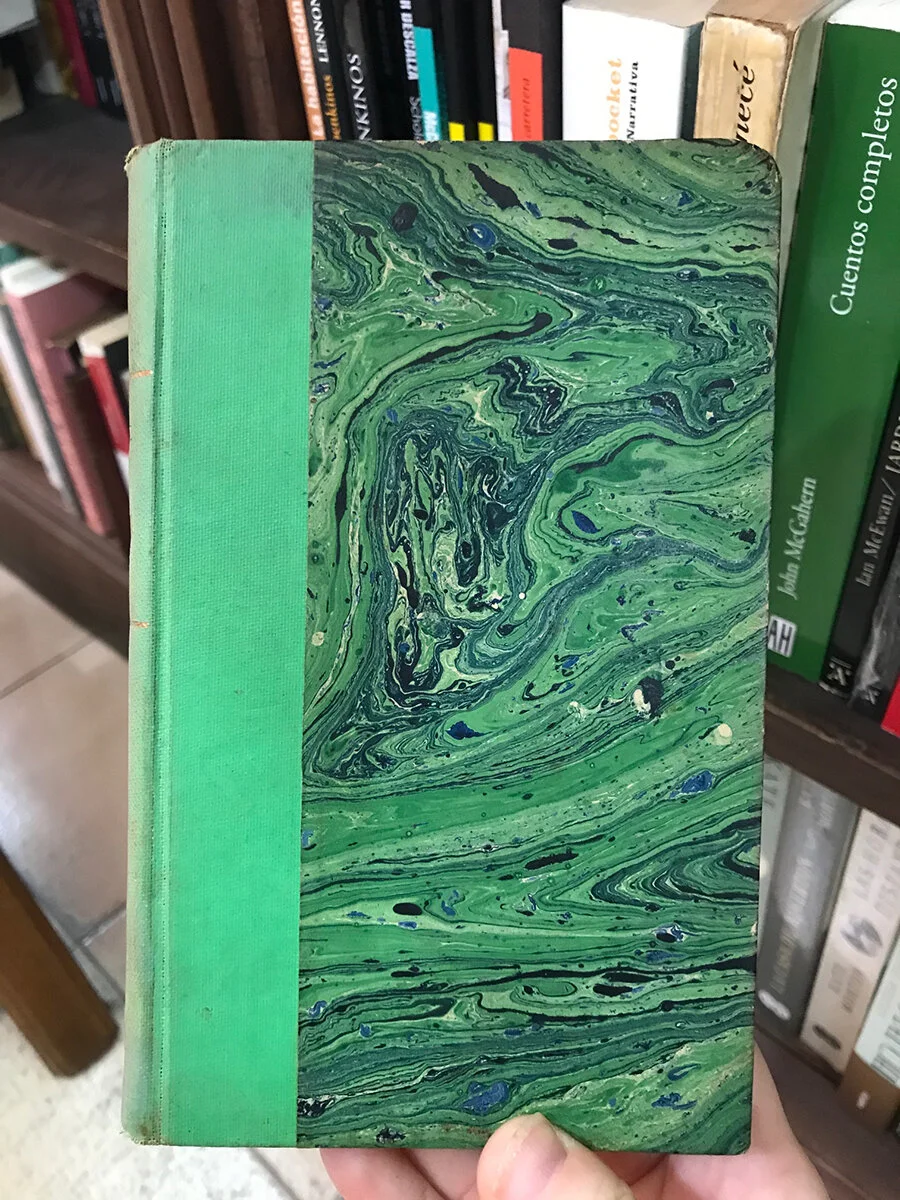
A page from one of Candace Hicks’ embroidered “Common Threads” composition notebooks, photographed during her Invisible Printmaking workshop at SGCI 2019 in Dallas. The writing and embroidered handwriting style are simultaneously casual and a little frantic.
Another marbled book cover, found in the Avila bookstore of Buenos Aires, in color. I found several other dusty examples on the shelves, but sadly did not purchase any of them